Simplicity Makes Perfect.
Inspired by how the Japanese live and focus in the"less is more". Kokoro was made to bring simple yet exquisite feelings to its customers / users and it resonate to the brand design.
Re-imagine the idea of accommodation business in the middle of Tokyo's hustle and bustle, we carefully thought the best approach to let users experience simplicity completely.
Kokoro (ココロ) means emotion or feelings.
Less is More.
Using black and white color schemes, we believe it will benefit from the use of an element of color contrast to set elements apart.
We also believe it can add extra bit of contrast or element of surprise to help users navigate and use the design.
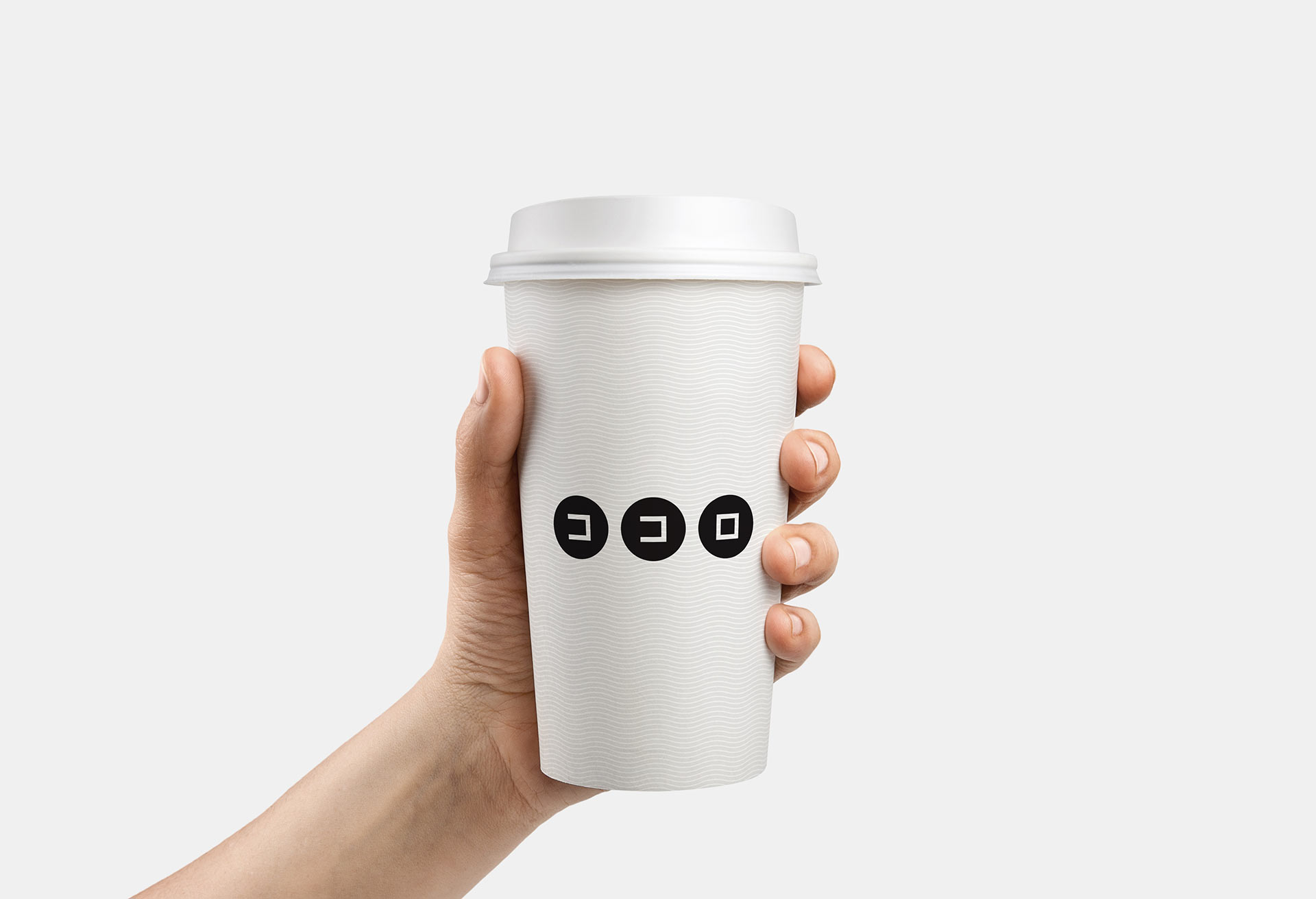
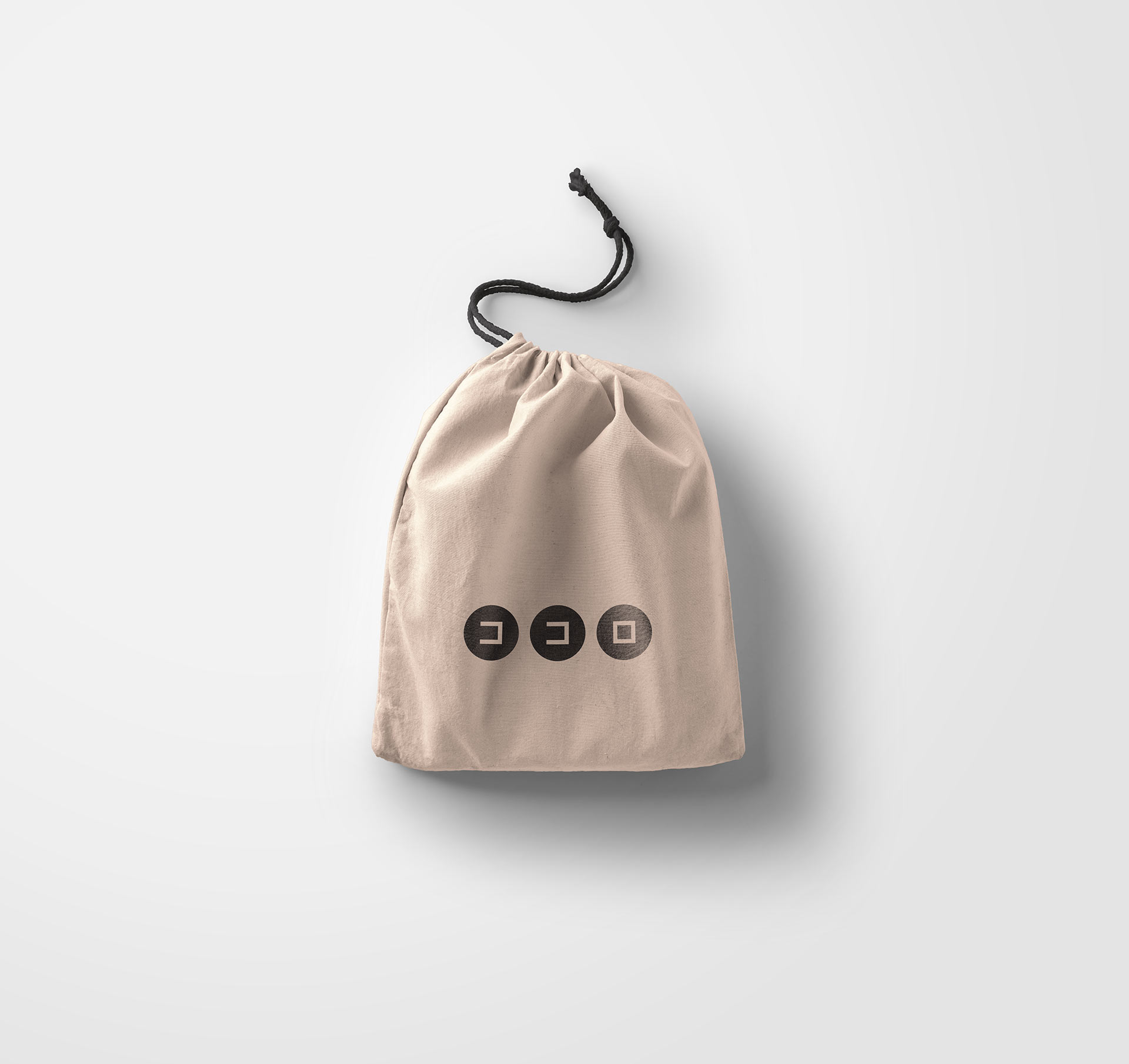

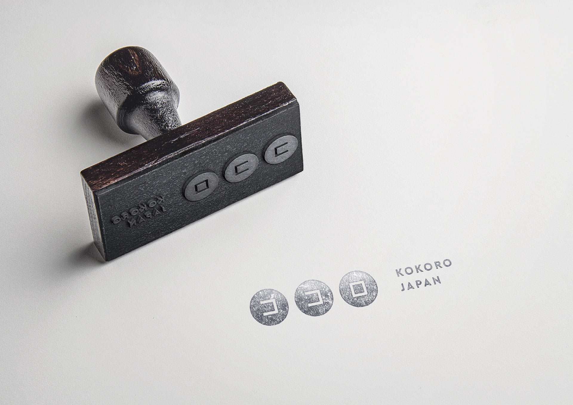
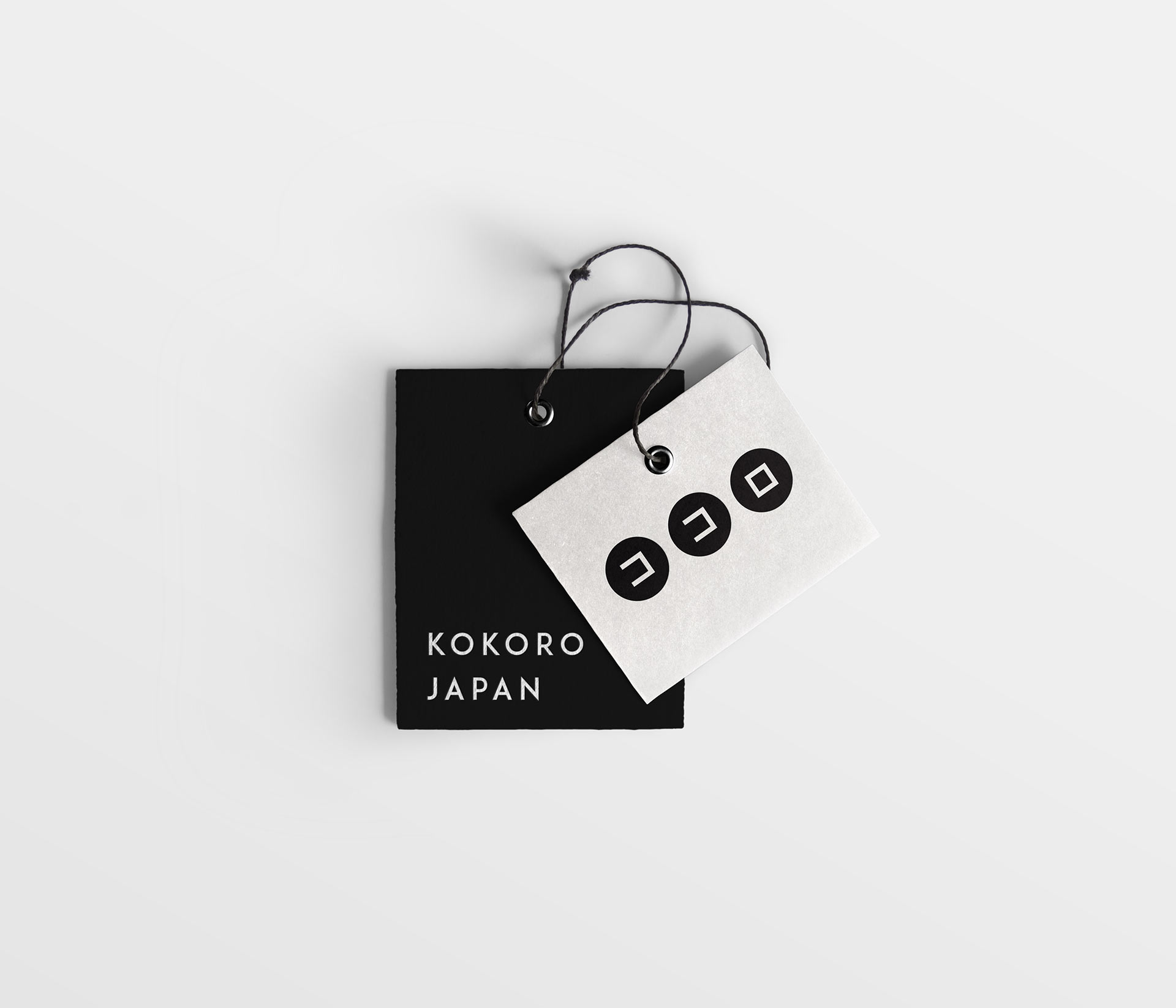
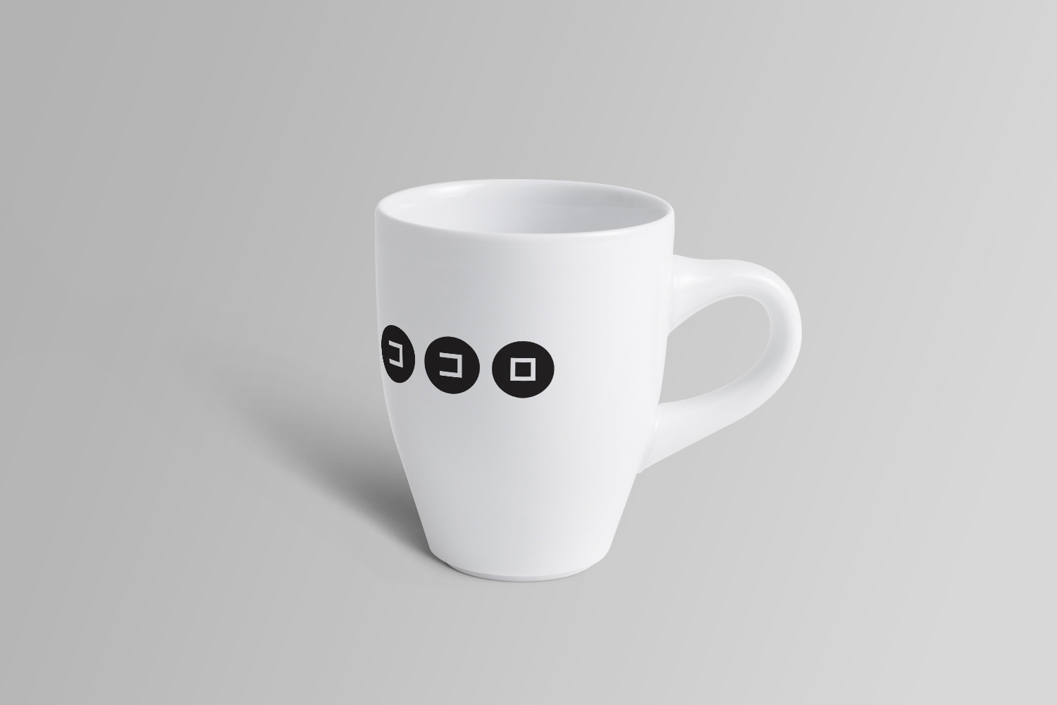

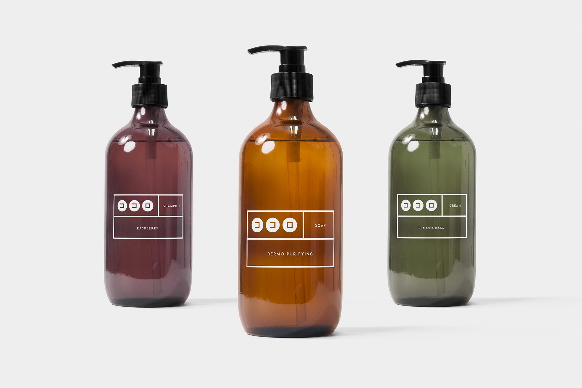
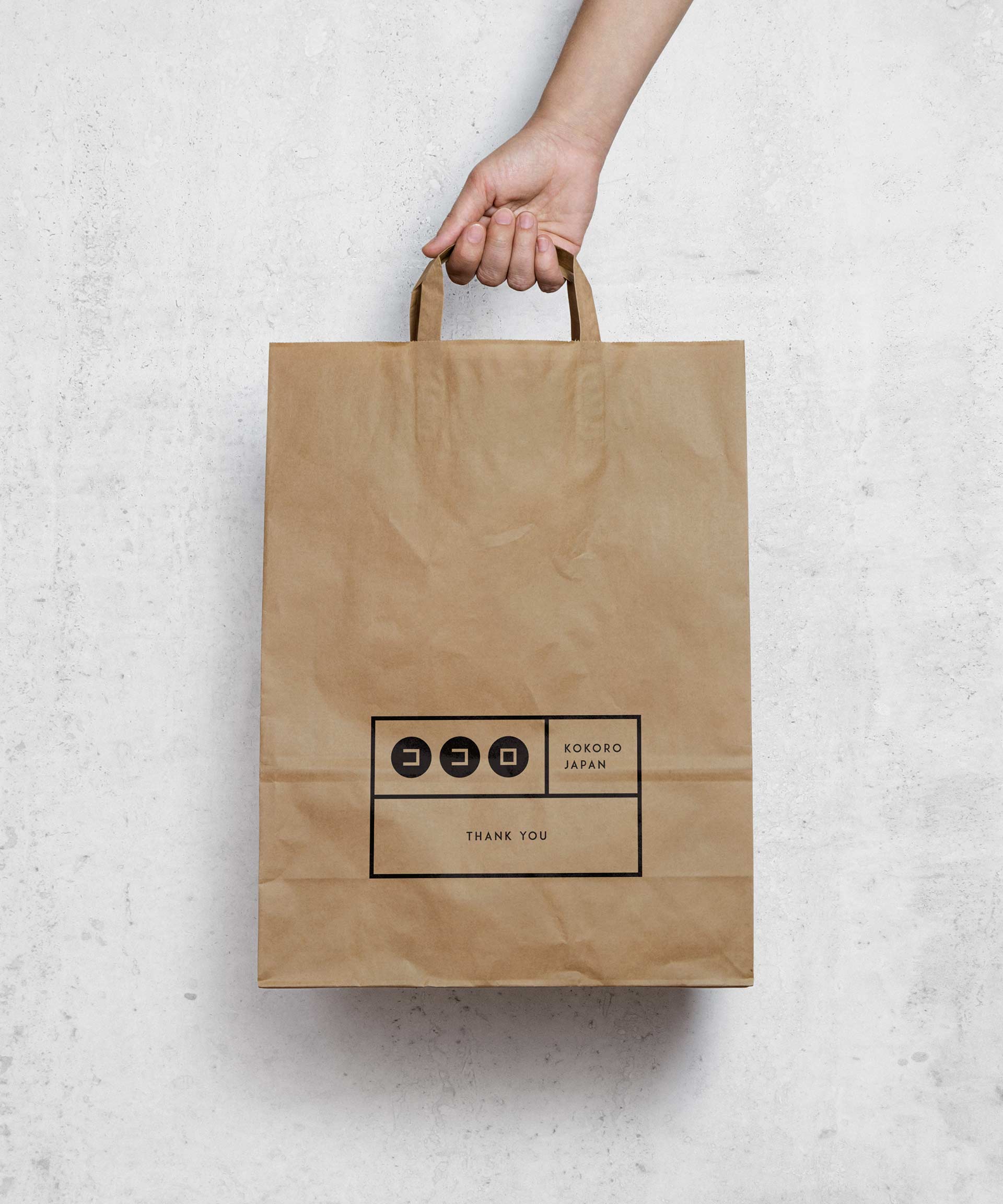
The brand is monochromatic, enticing and straight forward. Japanese language that are accompanied with the English translation to make it easy for all kinds of travelers that experience to stay in Kokoro.
we transform brands, engage customers and grow businesses
Our amazing team creates brilliant experiences for our clients and their customers using strategy, research, design, technology, communications, data and creative thinking.